
Upgrade design directions
A diagnosis of why Reacher’s upgrade surfaces felt flat, and three directions: native, proof panel and editorial.
- Strategy
- Design directions
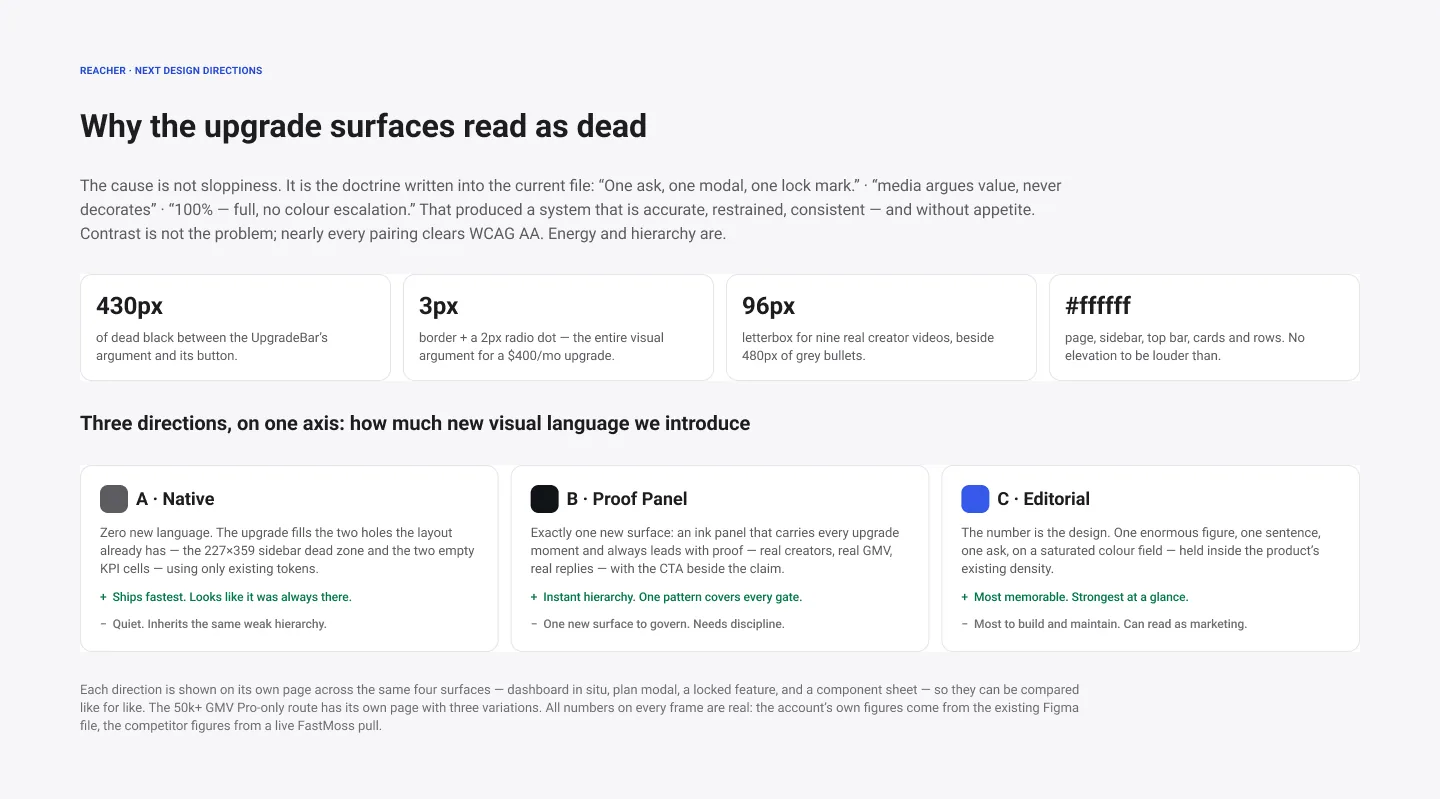
A short README that explains why the upgrade surfaces read as dead, then sets out three directions along one axis: how much new visual language to introduce. A, Native, ships fastest by borrowing the existing hierarchy. B, Proof Panel, adds an ink panel that carries proof in every upgrade moment. C, Editorial, makes one enormous figure the whole argument.
The diagnosis is concrete, with measurements taken from the live screens, such as 430px of dead space between an upgrade bar’s argument and its button, and an all-white page with no elevation to be louder than.
 View full size (opens in a new tab)
The README
The diagnosis in four numbers, then the three directions side by side.